There’s no universal template for accessibility. But in a city like Macon, where customers still shake hands after a deal and remember how they were treated, accessibility starts with whether someone can even use your website. Not on a perfect laptop. On a cracked Android in a car outside a clinic. On a screen reader at the library. On a phone with too-small buttons and too-bright banners. ADA compliance isn’t just about avoiding lawsuits. It’s about showing respect in the first five seconds. That respect looks like readable fonts, logical page flow, captions where they’re needed, and forms that don’t become traps. And more than that, it means not treating accessibility like a checkbox for someone else. It’s your business’s way of saying, “We see you. We thought about you. You belong here too.” In this cluster, we’ll walk through how real compliance lives in layout, tone, functionality, and structure, and how Macon businesses can start doing better today. Not when it’s convenient, but when it counts.
Web Design Checklists for ADA Compliance in Georgia
If you’ve never looked at your website like a stranger would, now’s the time. Imagine trying to book a consultation without being able to see your mouse. Imagine relying on a keyboard to fill out a form. Imagine reading your services with tired eyes and low vision. That’s where an ADA checklist starts. Not with code, but with perspective. First, your page structure. One H1 per page. Subheads that follow real order. No faking it with bold text just because it looks big. Screen readers don’t care about font. They follow logic. Next, every single button, menu, and form field has to be accessible by keyboard. If someone can’t tab through your page without hitting a dead end, that’s a barrier. Every image needs alt text. Not “photo.jpg” or “team shot.” Try “Jessica standing at front desk, smiling beside Macon Chamber of Commerce banner.” Labels for every form input. Not just floating text that vanishes. Clear, visible instructions that stick. Color contrast that doesn’t melt away in sunlight or on old devices. Red error messages paired with icons. Videos with captions. No autoplay. Focus indicators that are easy to spot. And most of all, test it. Run your site through Axe. Through WAVE. Then hand your phone to your aunt and watch her try to use it. The goal isn’t perfection. The goal is comfort. The kind that says, without bragging, “We didn’t forget about you.”
How ADA Rules Apply to Macon-Based Business Websites
You don’t have to be a hospital, a university, or a government agency to be covered by ADA. If you have a business in Macon and you serve the public, whether online or off, you’re expected to provide digital access the same way you provide a ramp or a handrail at your front door. That means if someone can’t read your service page because of low contrast, or they can’t fill out your contact form because your fields don’t have labels, that’s not just bad UX. It’s a civil rights issue. And while you might not have heard of ADA lawsuits landing in Macon yet, they’re showing up in Augusta, Savannah, Athens—places just like this one. The thing is, it’s not just about avoiding legal trouble. It’s about being the kind of business that builds trust in ways your competition doesn’t. You’d be surprised how many users abandon sites that feel like they weren’t built for them. Maybe they won’t say anything. Maybe they’ll never come back. That silence is what hurts you. ADA guidelines, grounded in WCAG standards, offer clear benchmarks. Structure, contrast, captions, control. None of it is flashy. All of it is foundational. And here’s the real win. When you meet those standards, your website doesn’t just avoid risk. It works better for everyone. Because when a site works well for someone with a disability, it usually works better for everyone else too.
Avoiding Common Legal Risks in Local Accessibility Design
Nobody in Macon opens a business thinking, “How can I get sued over my website?” And yet, that’s exactly what’s happened in towns just like this. Over a form field without a label. A menu that didn’t work with a keyboard. A “click here” link that said nothing at all. Most lawsuits start with frustration. Someone can’t find a phone number. They can’t read the schedule. They can’t submit a request. And if they feel like your site was built without them in mind, that’s a barrier. Barriers carry legal consequences. But here’s the part most folks miss. The risks aren’t just legal. They’re reputational. In a community-driven town like Macon, word of mouth travels fast. If someone has a bad digital experience, they’ll tell their neighbor, their church group, their Rotary Club. That’s trust you don’t get back with an apology email. The legal traps are predictable: no alt text, low contrast, no focus indicators, videos without captions, forms that disappear on mobile. And all of these are avoidable. Fixes don’t require massive budgets. They require awareness. A willingness to walk through your site like someone who can’t use a mouse. Or someone reading on a jittery screen with dim colors. Or someone who’s just plain exhausted and needs the process to feel human. ADA compliance isn’t a finish line. It’s a habit. One that keeps your site safe, usable, and most importantly, respectful.
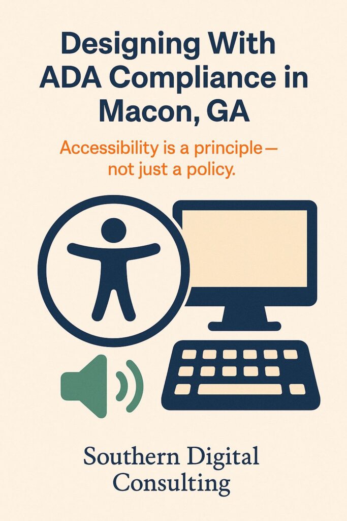
Integrating Alt Text and Keyboard Nav for Compliance
It’s easy to think accessibility is all about visuals. But for many users, the experience starts and ends with things they’ll never actually see. Alt text and keyboard navigation are the unsung heroes of real accessibility. For businesses in Macon, especially those serving older adults or customers with motor impairments, they’re the difference between a site that functions and one that frustrates. Alt text isn’t a technical detail. It’s a description. It tells someone what’s happening in an image they can’t see. It makes your page understandable for someone listening instead of looking. “Office team gathered around whiteboard” is okay. “Four-person team discussing marketing strategy inside Macon co-working space” is better. Keyboard navigation is equally crucial. Some people can’t use a mouse, either temporarily or permanently. If they can’t tab through your navigation bar, open a dropdown, or move inside a form without hitting a wall, your site becomes a locked door. Make sure every interactive element has a clear tab order. Use visible focus states. Let the user know where they are, even if they can’t see a cursor. And test it. On a real device. With real hands. No mouse. If you get stuck, so will someone else. Accessibility isn’t about sympathy. It’s about logistics. How can someone get from point A to point B without friction? Alt text and keyboard nav don’t shout. But they do hold the whole structure together. Without them, your best design work might never get experienced at all.
ADA-Compliant Color and Contrast Standards for Georgia
Designers love to get clever with color. But if your beautiful layout isn’t legible on a rainy day from the back of an old phone, what’s the point? In Georgia, where people browse on everything from brand-new iPhones to beat-up Androids with cracked screens and low brightness, contrast isn’t optional. It’s survival. ADA standards require a contrast ratio of at least 4.5:1 for normal text. That means light gray on white is out. Pale blue on ivory? Probably out too. Test it. Run your colors through a checker. But also just squint at your screen from across the room. Can you still read it? Can your mom? Can your customer who forgot their reading glasses? Compliance also means never relying on color alone to convey meaning. A red border around an error message is meaningless to someone with color blindness. Pair it with an icon. Add a label. And be careful with low-opacity overlays on images. What looks trendy can often leave your text unreadable. Good color usage doesn’t mean using only black and white. It means choosing combinations that respect the real-life conditions people read in. Sunlight, old screens, bad angles, aging eyes. You can still use color to express tone. Calm blues, energetic oranges, trustworthy greens. But your base readability has to come first. Don’t assume your color palette performs just because it looks good in the mockup. Test it like someone who’s in a hurry, squinting, half-distracted. Then fix what doesn’t hold up.
Want a Website That Works for Every Customer You Serve?
We help Macon businesses create websites that work not just for most people, but for all people. From contrast and navigation to captions and clarity, we’ll help you build a site that welcomes, includes, and protects. Visit ADA-compliant web design in Macon, GA and let’s design something that meets every eye, every device, and every customer where they are.