
Macon, GA may be growing, but it still moves with a kind of rhythm you don’t find in big-city Georgia. People aren’t in a rush to scroll past ten pages of fluff. They want to get where they’re going, fast and clear. Whether someone’s trying to schedule a windshield repair in Warner Robins or check your hours from a phone in the Ingleside Kroger parking lot, your website menu is what guides them. If it’s not designed for them, they’ll leave. And they won’t come back. This cluster explores how local businesses can create intuitive, mobile-first, human-friendly navigation systems that serve real people in Middle Georgia.
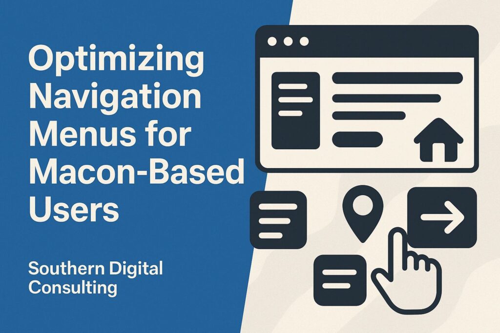
What Makes a Great Navigation Menu for Local Macon Visitors
Here in Macon, folks don’t have patience for vague websites that feel like mazes. They want their information like they want their iced tea. Straightforward and easy to find. A great navigation menu isn’t about flashy animations or clever naming. It’s about clarity, trust, and common sense. Put the essentials up front: Services, Contact, About. These aren’t just labels. They’re lifelines for someone landing on your homepage unsure of where to go next. You’re not impressing anyone with “Solutions” or “The Experience.” Use plain words that mean what they say.
Menus should be short and sharp. Don’t flood your header with ten options and hope users will dig through it. That’s not how anyone in Macon browses, especially not on mobile. Instead, group related items and prioritize the top three tasks your users come for. If most people want to book an appointment, read reviews, or call you, those links should be unmissable.
Design-wise, use high-contrast text, large enough to tap with a thumb, and consider accessibility from the start. That means clear focus states, keyboard-friendly structure, and no hover-only items that vanish on mobile. For smaller screens, a labeled hamburger icon (like “Menu”) works better than three unlabeled lines.
Finally, test your menu with people who don’t build websites. Ask your barber. Your retired aunt. A college kid at Mercer. If they hesitate or ask “Wait, where do I click?”, you’ve already lost them. A great navigation menu isn’t one that designers admire. It’s one that users forget exists because it’s that smooth.
Dropdown vs. Mega Menus: What Works Best for Macon Businesses
Every business owner eventually asks: Should I use a dropdown or a mega menu? And the answer depends less on trends and more on how your users behave. Especially here in Middle Georgia, where browsing patterns reflect a mix of tech-savvy teens and old-school professionals. The goal isn’t complexity. It’s comfort. So which format delivers?
Dropdown menus are the go-to for small sites with limited categories. A lawyer with three main services? Dropdown. A dentist with general, pediatric, and cosmetic treatments? Dropdown. But keep it basic. Hover to open, click to close, keyboard navigable, and legible on all screen sizes. Avoid deep nesting unless you want to frustrate users fast.
Mega menus, on the other hand, are better suited for larger businesses or e-commerce setups. A hardware store in Macon offering dozens of categories? Or a local grocery chain with departments from produce to pharmacy? Mega menus give you real estate to group links under clear headings. But that space must be used wisely. Organized, scannable, never cluttered. Think clean grid layouts, 3–4 column structures, and avoid stuffing everything in just in case.
Another critical factor? Device usage. Macon’s mobile traffic is heavy. Many customers browse from phones during lunch breaks or after dinner. Mega menus that work beautifully on desktop often collapse into chaotic stacks on mobile. If you go mega, ensure there’s a mobile-friendly fallback: expandable sections, accordion tabs, or simplified submenus that don’t overwhelm.
At the end of the day, the best menu structure is the one that works without explanation. And here in Macon, where people still value “simple, clear, and polite,” over-designing your menu is just as bad as under-designing it. So test both formats, watch real user behavior, and don’t pick based on what New York startups are doing. Pick what makes sense on Spring Street.
How Navigation Impacts Bounce Rate in Macon, GA Sites
A confusing menu can sabotage a Macon business faster than a one-star Google review. Why? Because people here don’t waste time. If they can’t find what they need within 10 to 15 seconds, they’re gone. And they’ll find it from someone else, maybe just down the road in Warner Robins. And Google notices. Your bounce rate—how many people visit your site and leave without interacting—tells search engines whether your site is worth ranking. Menus are often the cause.
Let’s break it down. Say a user lands on a site for a roofing company in Macon. They’re expecting to see a clear link like “Roof Repairs” or “Free Estimates.” Instead, the menu says “Solutions” with vague dropdowns labeled “Residential” and “Premium.” Confused, the user backs out. That’s a bounce. Multiply that across dozens of visits a day, and suddenly your SEO rankings tank.
But it’s not just about labels. It’s order, hierarchy, and predictability. Local users skim fast. If they have to hover, guess, or dig, they leave. Top-performing Macon sites often follow the same structure: Home – About – Services – Testimonials – Contact. It’s boring, but it works.
Then there’s mobile bounce. On small screens, a poorly built menu that doesn’t open, overlaps content, or loads too slowly leads to abandonment. Menus must be lightweight, fast-loading, and positioned logically. Especially on devices with older software or limited bandwidth.
Want to lower bounce rate? Start with your menu. Track clicks with tools like Hotjar or Microsoft Clarity. Look at rage clicks, hesitation time, or navigation loops. Are users getting stuck? Repeating actions? That’s friction. And friction causes exits.
A high bounce rate doesn’t mean your content is bad. It often means your navigation is broken. And in Macon, where customer relationships are built on trust and ease, your menu is the first chance to get it right. Or lose them for good.
Designing for Thumb-Zone Usability on Mobile in Macon
Mobile usage in Macon isn’t a trend. It’s the default. Whether it’s someone standing in line at The Rookery or browsing from their porch in Gray, thumbs are the new cursors. And if your navigation isn’t designed for thumb interaction, you’re unintentionally locking out a huge portion of your market.
Thumb-zone usability means placing key menu items within easy reach of the average user’s thumb. Especially when holding a phone one-handed. Top-left hamburger icons? Terrible. Bottom or mid-screen buttons? Much better. Floating action menus? Excellent, if they’re stable and not covering content.
Font size matters too. If someone has to zoom to click “Schedule,” you’ve already lost them. Use tap targets of at least 48x48px, and avoid clustering links together where a fat-fingered tap hits the wrong item. Space is not the enemy. Clutter is.
Also consider context. If your main users are older adults booking medical appointments, don’t rely on gestures like swipe to open. Stick with visible, labeled buttons. If your users are younger, multi-lingual, or tech-hybrid (like business owners on the go), prioritize speed. Preload menus, minimize animations, and keep headers sticky.
Menus should remain visible but not intrusive. Fixed headers that shrink or hide intelligently work well. Avoid full-screen overlays unless they’re responsive and clearly exit-able. A menu should never trap the user.
Above all, test on real devices. That means iPhones, Androids, budget tablets—especially older ones. Macon doesn’t just run on MacBooks. Build for the tools people actually use here, not what you wish they had. Because when it works smoothly under someone’s thumb, they stay. And staying leads to action.
Case Study: Menu Optimization for a Macon E-Commerce Store
Let’s look at a real-world example: a Macon-based e-commerce site selling outdoor gear. Before a redesign, the menu included eight top-level items: Home, Shop, About, Blog, Reviews, FAQs, Contact, and Login. On desktop, it was cluttered. On mobile, it was chaos. Bounce rate hovered at 68%, and users often abandoned cart pages because they couldn’t return to product categories.
First, the team conducted a click map study using Microsoft Clarity. Turns out 80% of users only clicked three menu items: Shop, Cart, and Contact. Everything else? Noise. The team streamlined the main nav into just three items: “Shop Gear,” “My Account,” and a cart icon. Everything else was moved to a clean footer.
They added a sticky bottom nav on mobile—always accessible, always readable. “Shop” opened a categorized mega menu with large icons (Tents, Hiking Shoes, Cooking), while “My Account” housed order history and support. Cart had a dynamic badge. No dropdowns. No double taps.
After launch, bounce dropped by 22%. Time on site increased. Cart completion rate rose 31%. But the biggest win? Customers stopped calling to ask how to check out. The site began working like a local store should: clear, friendly, and ready to help.
The lesson? Menus aren’t just about navigation. They’re about confidence. In Macon, where word of mouth still matters and customer patience is finite, a smooth menu feels like a handshake. That outdoor brand didn’t just fix its interface. It built trust. Quietly. Efficiently. One thumb at a time.
Want Navigation That Works as Hard as You Do in Macon?
We build websites that don’t just look good. They feel local, intentional, and easy to use. Whether you’re selling fishing rods in Milledgeville or offering family law services downtown, your navigation can either lose the user or lead them home. At Southern Digital Consulting, we specialize in Macon-first UX that guides, not confuses. Let’s rethink your site together. Visit UX-driven websites in Macon to get started.