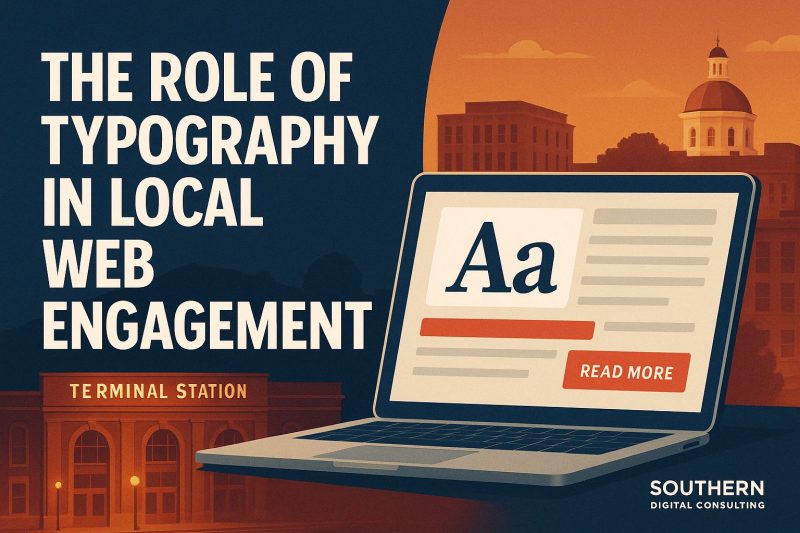
When someone in Central Georgia opens your site, they don’t think, “I wonder which font this is.” But they do feel it. They notice if they’re squinting. They notice if it’s too tight, too formal, or too playful. They notice the tone, even if they can’t name it. And around here, where folks value straightforwardness and familiarity, your font either invites them in quietly or nudges them back to Google. Typography isn’t flair. It’s a filter. Before anyone reads a word, they decide if those words feel like they belong. The font doesn’t just deliver your message. It shapes it. So if your site isn’t getting read, it might not be what you’re saying. It might be what your letters are wearing.
Typography Trends That Work for Macon-Based Brands
We don’t see a lot of people in Macon chasing design fads. And that’s probably a good thing. Most local businesses aren’t trying to “go viral.” They’re trying to be understood. They want their sites to load, read clean, and make people feel at home. So it’s not surprising that the fonts that are working best aren’t flashy. They’re steady.
There’s been a quiet return to fonts like Georgia, Libre Baskerville, or Tisa. These are serifs that feel grown-up but not stuffy. They give headlines a little weight and a little age. Something that says, “We’ve been around the block. You’re in safe hands.” And for body text, Inter, Source Sans, and the ever-trusty Open Sans are showing up more and more. Why? Because they’re readable. On laptops, tablets, beat-up Androids—it doesn’t matter. They just work.
Spacing is a trend too, even if most people don’t realize it. Looser line heights and more breathing room between paragraphs. It feels better, especially when someone’s multitasking on a slow connection.
And people are finally ditching those ultra-thin fonts. You know the ones. You open a site, and it looks like someone typed it with a mechanical pencil running out of lead. Around here, folks don’t squint through their shopping cart. They just leave.
The fonts that work in Macon today are the ones that stay out of the way. Not invisible, but comfortable. Like a store with good lighting. You walk in and think, “Yeah, I can stay a minute.”
How Font Choices Affect Trust and Readability in Georgia Markets
There’s nothing worse than landing on a website that feels like it’s whispering. Light gray text on a white background. Tiny fonts that demand perfect vision. Letters so tightly packed you feel like you’re reading a legal waiver. Trust doesn’t survive that. Especially not in Georgia, where people are used to being greeted with a handshake, not a magnifying glass.
You don’t have to be a designer to know when something feels off. It’s a gut thing. You open a site and something in your brain goes, “Hmm… no thanks.” That reaction can come from bad spacing, poor contrast, or fonts that just don’t fit the tone. If you’re an HVAC company using a bubbly script, it doesn’t matter how good your reviews are. Your font already told the visitor this isn’t serious.
Trust starts with clarity. Font size, line height, and layout hierarchy all send subtle signals. “We care how this feels to read.” And when a site reads easily, the reader assumes everything else—your scheduling, your pricing, your follow-through—will be easy too.
Readability isn’t just about glasses. It’s about effort. Nobody should have to work to understand your business. If they do, they’ll go somewhere that feels simpler. That’s not a design critique. It’s survival instinct.
If you want to build trust, don’t overthink the decoration. Make the letters do their job. Let them hold the weight of your message. Clean, steady, welcoming. That’s the voice your font should speak with.
Serif vs. Sans: Which Fonts Resonate Most in Macon?
Ask ten designers and they’ll give you a debate. Serifs are formal. Sans-serifs are modern. But if you ask ten local business owners, they’ll say, “I just want people to be able to read the dang thing.” And that’s the point.
Serif fonts carry quiet authority. They feel older in a good way. Banks, law offices, maybe a long-standing family business use serifs because they want to sound like they’ve been here a while. And they probably have. Fonts like Cormorant, Garamond, or even good old Georgia lend gravity. Not too much. Just enough to say, “You can trust us with the big stuff.”
Sans-serifs, though, are everywhere. And for good reason. They’re clean, fast to load, and easy to read on screens. Especially on phones, which is where half of Macon is browsing. If you’re a lawn care company, a local shop, or a service that lives or dies by quick quotes and contact forms, sans-serif fonts keep things moving. Lato, Poppins, Roboto. They don’t try to impress. They just get the job done.
Lately, the mix is what resonates. A serif headline to start the conversation. A sans-serif paragraph to keep it going. That contrast helps users know where to look and where to rest. It creates rhythm, and rhythm feels reliable.
Macon doesn’t need trendy. It needs typography that sounds like a good neighbor. Steady, clear, and just human enough.
Using Typography to Improve Time-on-Page in Local Sites
Most bounce rates don’t come from bad products. They come from bad feelings. If someone lands on your site and their eyes tense up, if the font’s too dense, too tight, or too faint, they’re gone. They don’t scroll. They don’t click. They just leave.
Typography is the feel of your page. And the better it feels, the longer people stay. In Macon, where a lot of users are older, on tablets, or browsing during lunch in bad lighting, that feel matters even more. It’s not about style points. It’s about whether reading your website feels like effort or ease.
Big blocks of text? Break them up. Headers? Use them early and often. Let readers rest. Let them skim. You’re not writing a novel. You’re having a conversation.
16px is the new minimum. Anything smaller feels like a whisper from across the room. Line height? Open it up. Font weight? Regular or medium. Not light, unless you want to be ignored.
Sometimes people think content keeps visitors on the page. And that’s true to a point. But if the text feels hard to follow, no matter how brilliant it is, it’ll never be read.
Typography doesn’t need applause. It just needs to not get in the way. When that happens, the numbers speak for themselves—longer sessions, lower bounce, and more clicks where it counts.
Best Font Pairings for Web Design in Macon, GA
There’s an art to font pairing, but around here, it better come with a little practicality too. You can’t just slap two trendy fonts together and hope it works. They’ve got to talk to each other. Not argue. Not compete. Just get along.
For a local service business that wants to sound established? Try Merriweather for headlines and Open Sans for body text. The serif says “we’ve been here.” The sans says “we’re easy to work with.” It’s a solid handshake of a combo.
Running a boutique or creative shop? Go for Playfair Display on headers with Source Sans Pro underneath. There’s just enough contrast to be stylish, but it still reads like you’ve got your act together.
Need something simple and tech-friendly? Roboto for everything, just in different weights and sizes. It keeps the tone consistent and modern. No frills. No fuss.
The best pairings work like your best employees. They’re different, but they make each other better. One leads. One supports. And nobody notices them unless they mess up.
Don’t pick fonts because they looked good on some out-of-context Canva post. Try them on your actual content. On your actual device. Ask someone who doesn’t know fonts at all how it feels. That’s the test. If they can read it, trust it, and move on without thinking about it, that’s the one.
Want Typography That Feels Like You?
At Southern Digital Consulting, we help brands across the region shape their message with fonts that don’t just look good. They work. Whether you’re redesigning from scratch or tightening what’s already live, we’ll help your words land with the people who matter most. Visit typography-first web design in Central Georgia and let’s make your message feel like something they want to read.


