
Why Website Structure Still Decides Who Wins Online
Most businesses in Macon don’t fail because of bad ideas. They fail because the digital version of those ideas doesn’t connect. Your website isn’t just your first impression. It’s your operating system. It shapes how customers understand your value, how search engines index your content, and how users decide whether to click, scroll, book, or bounce. Yet most websites are still built backwards. Design first. Structure second. Content last. At Southern Digital Consulting, we’ve spent years working with Georgia-based businesses that do incredible work offline but struggle to communicate it online. What we’ve found is simple. The brands that win don’t just look better. They’re built better. Their sites load faster. Speak more clearly. Convert more consistently. And scale with purpose. This guide isn’t about trends or templates. It’s about foundations. We created it for the business owner who’s tired of guessing. Tired of pouring money into redesigns that don’t move the needle. Tired of hearing that their website “just needs a refresh.” It doesn’t. It needs a strategy. What follows is that strategy. Page by page. System by system. Built for how people actually use the web today in Macon and across Middle Georgia.
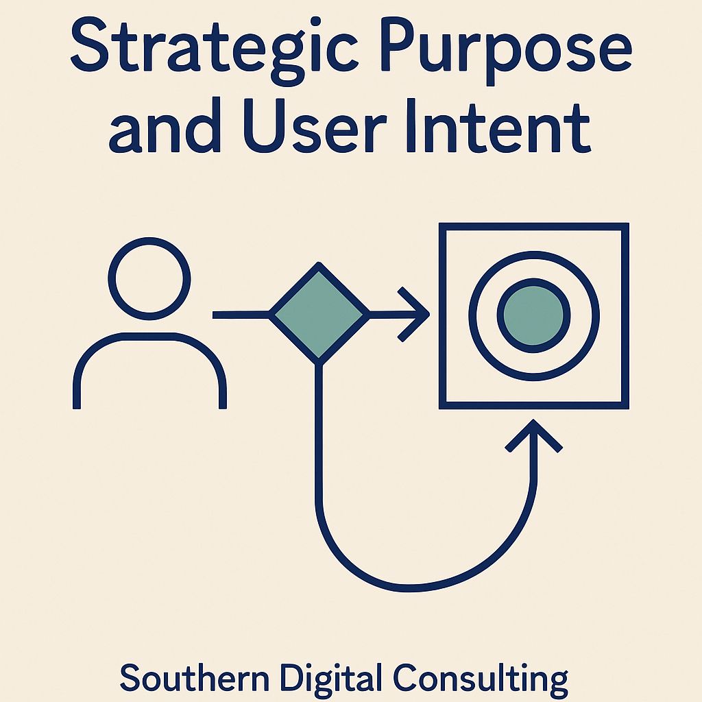
1. Strategic Purpose and User Intent
Every high-performing website begins by answering a single question before any layout, color, or feature is discussed: why does this site exist, and who is it built for? In Macon, that question is more than theoretical. It’s practical. A visitor who lands on your homepage isn’t browsing for inspiration. They’re there because something triggered a need. It might be a leaking roof, a legal concern, or a decision about where to send their child for preschool. These are real situations with real stakes. That means your website isn’t just a digital presence. It’s a solution platform. Its structure, tone, and flow must be aligned with what your users are already trying to solve. This is the essence of purpose. Not a slogan, not a branding exercise, but a precise, experience-driven answer to what the user needs next.
Designing with intent means mapping your entire site to actual human behavior. Visitors don’t explore randomly. They look for reassurance, for confirmation, for a clear next step. If your site opens with abstract copy and scattered links, you’ve lost them before they scroll. But when every page is built around a defined conversion goal, whether it’s scheduling, comparing, requesting, or learning, the user recognizes that you understand their urgency. In Macon, where local trust still outweighs national buzzwords, this kind of alignment signals professionalism. It tells visitors they’re not being sold to. They’re being served.
Purpose also informs visual hierarchy and messaging strategy. It dictates which headlines carry weight, which CTAs deserve prominence, and which distractions should be eliminated. Not every page needs to sell, but every page needs a job. Whether someone enters your site at the homepage, a blog post, or a location page, the same principle applies. They should never wonder what the site is trying to do. Purpose gives the site spine. It turns content into action, structure into clarity, and brands into something useful. Without it, even a beautiful website will confuse more than it converts.
2. User Experience and Functional Usability
A website that doesn’t feel usable won’t be used. It doesn’t matter how well it ranks, how modern it looks, or how many ads push traffic toward it. If the experience frustrates, visitors leave. In Macon, where businesses compete on service and trust more than sheer volume, websites must operate like digital storefronts that welcome, guide, and reassure. That means usability can’t be an afterthought. It must be the blueprint. Every menu, every section break, every scroll pattern should be crafted with the assumption that the user is trying to complete something specific. They may be comparing providers on their phone while in a waiting room. They may be navigating the site with limited mobility. They may be on an old tablet with slow internet. Your site must accommodate all of them. Functionality means your structure works across every situation, not just on a designer’s laptop in perfect conditions.
True usability starts with intuitive navigation. If your user has to guess where to click, you’ve already introduced hesitation. Hesitation kills momentum. Your menus must be predictable, your page layout must match natural reading patterns, and your calls to action should never be buried. But usability goes further than layout. It’s in the typography choices that prevent eye strain. It’s in the consistent spacing that tells users when one thought ends and another begins. It’s in the way forms don’t erase when submitted with an error. Functional design isn’t sterile or generic. It’s specific. It anticipates friction and eliminates it before the user has to think. When websites succeed at this, users stay longer, move more confidently, and convert more naturally. They don’t say, “This was usable.” They simply finish what they came to do, and they remember that it felt easy.
Macon users, like anywhere else, may not know how to describe good UX, but they instantly notice when it’s missing. If a phone number isn’t tappable, if text runs off the screen, if a “Get a Quote” button loads nothing, the impression left is not just inconvenience. It’s doubt. And doubt online is as damaging as silence in a sales meeting. Functional usability must therefore be part of your website’s core promise. It says, “We respect your time. We understand your task. We’ve prepared for your next step.” That’s how you transform visitors into clients, not by impressing them, but by equipping them.
3. Visual Hierarchy and Layout Logic
At Southern Digital Consulting, we don’t design by instinct. We design by priority. Visual hierarchy isn’t just about which colors pop or where your logo sits. It’s about guiding the eye, pacing attention, and helping people decide what to do next without having to figure it out themselves. In Macon, where small businesses compete on clarity and trust rather than flash, your layout must act like a silent tour guide. Each headline, image, icon, and block of text sends a signal. That signal should be intentional. If your most important message is buried beneath a carousel, if your CTA blends into a block of text, or if your headlines compete instead of lead, you’re not guiding. You’re scattering. A good visual hierarchy answers one question over and over again: what matters most right now?
We begin every layout by mapping it to the user’s task flow. What is the first thing someone needs to know? What question are they asking without typing it? In Macon, a service page for HVAC installation should not open with a brand origin story. It should show service availability, response times, pricing context, and next steps clearly. That means using typography to establish weight, spacing to create pacing, and color to drive interaction. Bigger isn’t always better. Brighter doesn’t always convert. Hierarchy is about contrast, not chaos. We use scale, position, alignment, and grouping to make sure users always know what to read first, what to scan next, and where to click when ready. Our layouts are built not for visual decoration, but for directional momentum.
Structure is the skeleton of a persuasive page. We favor grid-based logic that adapts across devices, giving each screen size the clarity it deserves. On desktop, that might mean a three-column section with clear entry and exit points. On mobile, it becomes a vertically stacked flow with collapsible elements and generous padding. In both cases, we apply progressive disclosure. We show only what’s necessary at each stage so users aren’t overloaded. Nothing is accidental. If a testimonial appears after a pricing table, it’s there to reinforce credibility when doubt peaks. If a secondary CTA shows up after the scroll pause, it’s because that’s where conversion intent spikes. This isn’t guesswork. It’s the architecture of decision-making.
Visual hierarchy is where brand meets behavior. When structured correctly, your layout doesn’t just look clean. It removes friction. It allows visitors in Macon to evaluate, engage, and act without effort. We don’t build pages that just look good. We build pages that think ahead. Because attention isn’t just won. It’s directed.
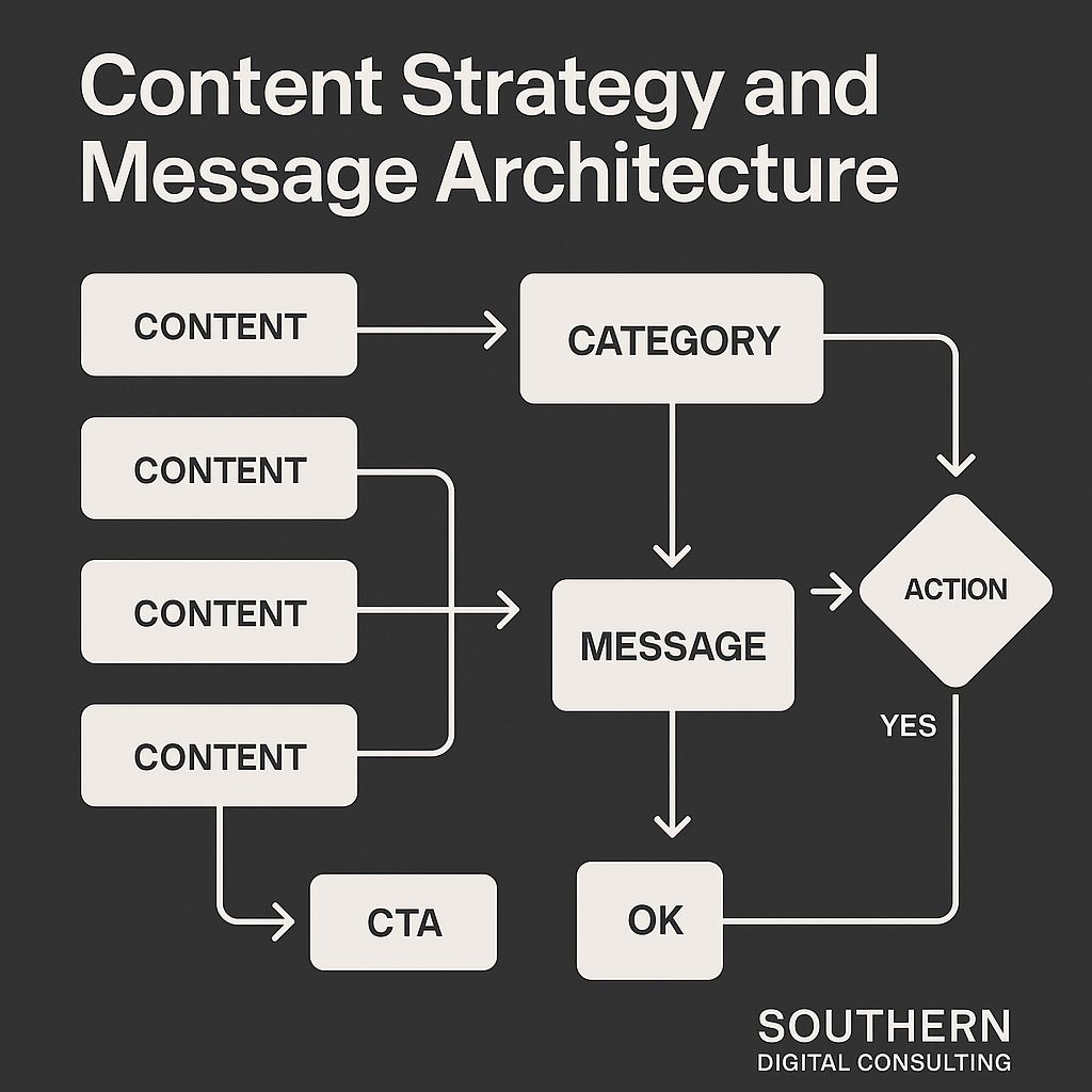
4. Content Strategy and Message Architecture
Content without strategy is noise. At Southern Digital Consulting, we treat every line, every heading, and every CTA not as decoration, but as structured communication built to match intent. In Macon, where businesses often rise or fall on how clearly they explain what they do, your website content must behave like a conversation, not a broadcast. That means your message isn’t just what you say. It’s what people understand, in the order they expect, at the moment they need it. Strategy begins long before copywriting. We ask what role each page plays, who the user is at that stage, and what mental state they’re in when they arrive. A homepage for a family lawyer shouldn’t open with generic claims. It should name problems with empathy, point to a resolution, and guide the user toward clarity in seconds. That structure isn’t art. It’s psychology. Message architecture isn’t about sounding clever. It’s about creating rhythm and relevance with every scroll.
Strong content strategy starts with mapping core user paths and assigning content goals to each. Some pages must inform. Some persuade. Some reassure. The tone must adjust accordingly. In Macon, where clients often skim on mobile or scan while multitasking, clarity wins over cleverness. We segment content into clear thematic blocks, using subheadings as signals, not decoration. We place testimonials where emotional friction rises, add detail where skepticism grows, and create breathing room where decisions stall. The result is content that behaves like a smart sales rep, active, relevant, and human. Every paragraph answers a silent question. Every call to action respects readiness. And most of all, every sentence has a job.
We also build content that supports SEO without sounding like it was written for robots. Long-tail phrasing is integrated into real questions people ask. We don’t stuff keywords. We answer them. Macon users aren’t just looking for services. They’re looking for signs that they’ve found the right provider. Our content proves that by being specific. Not “We offer quality service,” but “We replace broken well pumps within 48 hours, anywhere in Bibb County.” Message architecture means that type of detail doesn’t get buried. It gets spotlighted. In a world full of filler content, clarity is a competitive edge. We write like we’re solving something, not performing. Because the goal isn’t to publish more. It’s to communicate better.
5. Conversion Strategy and CTA Design
At Southern Digital Consulting, we treat conversion as the final expression of a website’s intent, not just a button at the end of a page. In Macon, where most visitors are not browsing for fun but acting out of urgency or need, your site must translate attention into action with precision. That requires more than “Learn More” or “Submit.” Conversion strategy begins with understanding the psychology of readiness. Every visitor arrives in a different state. Some are just gathering information, some are comparing options, and some are moments away from reaching out. Your calls to action must meet them where they are. That means CTA language, placement, and visual contrast must all reflect intention. Not every CTA should shout. Some should reassure. Some should invite. And some must clarify exactly what happens next. A good conversion system doesn’t push the user. It lets them say yes.
We build CTAs that respect timing. That includes multi-stage offers like “See Pricing Before You Schedule,” or commitment-scaled options like “Call Now,” “Request a Callback,” and “Get a Detailed Quote.” These aren’t aesthetic choices. They’re conversion ladders. Each CTA is part of a sequence designed to match different levels of confidence. In Macon, where trust is currency, a CTA should feel like a handshake, not a trap. Placement matters too. Above the fold is for urgency. Mid-scroll is for decision-making. Footer CTAs are for second thoughts. We also build dynamic CTAs triggered by scroll behavior, time on page, or interaction context. Our forms support micro-conversions—for a full breakdown of form behavior and submission flow, explore our form strategy for local conversions. Conversion happens through flow, not friction.
Design supports strategy. Our CTAs are visually distinct but never abrasive. We use whitespace, directional cues, and rhythmic layout to give each action its own space. CTA buttons shouldn’t compete. They should guide. That’s why our designs test message pairs like “Book a Free Assessment” vs. “Talk to an Expert Today” and monitor what your audience clicks, skips, or hesitates on. And when someone does convert, that moment shouldn’t feel like the end. It should feel like the beginning of a well-prepared relationship. Because in Macon, conversion is never just about the click. It’s about what comes next.
6. Mobile Responsiveness and Device Adaptation
Mobile-first thinking isn’t a luxury anymore. It’s the foundation. Responsiveness means more than rearranging columns for a smaller screen. It means designing with the assumption that your audience is on a phone, possibly one-handed, dealing with slow data, or multitasking from a kitchen counter in Macon. Local users visit business sites between errands, in parked cars, or while waiting on food. If your site doesn’t load fast, scroll smooth, and offer immediate clarity, it doesn’t just underperform. It disappears.
A responsive layout should prioritize flow over flair. That includes tap-friendly buttons, scannable content, and interaction patterns that anticipate mobile behaviors. Key calls to action must live within thumb zones, not buried behind complex navigation. Typography needs to be large enough to skim but compact enough to fit. Spacing can’t be decorative—it needs to pace the reading experience. On older phones and limited networks, functionality becomes accessibility. And accessibility is what drives conversions.
Mobile testing happens across real conditions. Multiple screen sizes. Weak signals. Older iPhones. Budget Androids. Every component must shift gracefully. Cards stack cleanly. Forms simplify automatically. Scrolls don’t stall. CTAs remain anchored but never overbearing. Images compress without losing relevance. Non-essential animations delay-load or hide completely. Date pickers switch to native views, input fields adjust to numeric keypads, and layout friction dissolves before it appears. The layout’s intelligence isn’t in its flash. It’s in its forgiveness.
Designing for mobile isn’t about compromise. It’s about awareness. A website that adapts visually and behaviorally builds credibility without a word. Because when users in Macon can act quickly, clearly, and confidently on any device, your message doesn’t just get delivered. It lands.
7. Information Architecture and Page-Level Strategy
Information architecture isn’t a sitemap. It’s a system of decisions about what users need, when they need it, and how fast they can find it. For local businesses in Macon, this often gets overlooked in favor of aesthetics or copy. But structure is what makes content usable. A beautiful homepage that leads nowhere is a dead end. A well-written service page buried three clicks deep might as well not exist. Real information architecture starts by mapping user journeys to business goals, then designing pathways that reduce thinking, friction, and clicks. It’s not just about menus. It’s about intent. A strong page-level strategy organizes information by decision point, not by department.
Each site we plan begins with five core layers: homepage, category or overview pages, service or conversion pages, supporting content, and action prompts. These aren’t just navigation tiers. They reflect stages of trust. The homepage introduces. Categories orient. Services persuade. Supporting content reassures. CTAs convert. In Macon, where businesses often compete on clarity and familiarity, skipping any of these layers breaks the funnel. That’s why we use content clustering, internal linking patterns, and visual layout logic to hold attention. Every page must carry its own weight but also fit into a larger system. That system is designed for scanning, not wandering. It’s built around real user questions, not internal silos.
URL structure and breadcrumbs matter more than most realize. A clear trail reinforces place and progress. Descriptive slugs help users and search engines align content with context. We never bury action behind vague menus. Instead, we use descriptive links, sidebar reinforcement, and sticky secondary navs when needed. If someone lands on a blog post about seasonal roof maintenance, they should see a CTA for inspections, a link to roof types, and a testimonial related to weather-based repairs. That’s page-level intent mapping in practice.
Good architecture doesn’t feel complex. It feels comfortable. When users in Macon can predict where to go next and get there without friction, they stay longer, engage more deeply, and convert more consistently. Your website shouldn’t feel like it was built by departments. It should feel like it was built for people.
8. Internal Linking and Engagement Pathways
Internal linking isn’t just about SEO structure. It’s about guiding real people through real decisions. A well-placed internal link says, “If this matters to you, keep going.” We craft link systems that align with user intent, not just category logic. The goal is to help visitors on your website, especially those in Macon, move naturally from curiosity to confidence. For example, guiding someone from a roof repair checklist to a booking page isn’t just smart UX. It’s good business.
Our internal linking approach focuses on three outcomes: deeper engagement, longer sessions, and clearer calls to action. We use anchor clusters that make sense from a user perspective. A service page might lead to a process explainer. A blog post might offer a related case study. A testimonial might prompt a quote request. But we don’t overdo it. Clarity matters more than quantity. Links should feel like forward movement, not distractions. If someone reading about water damage sees “What to expect from our restoration team,” it should feel like the next logical step, not a marketing trick. Engagement builds when navigation supports user logic.
We place engagement links at key decision points. After testimonials. Before pricing breakdowns. Near visual transitions. We also prioritize above-the-fold link visibility without crowding the interface. Each click should feel like an invitation, not an obligation. And while SEO benefits from these patterns, the goal here is always human-first. Internal linking is about story structure, not search signals.
For a more technical breakdown on how internal links affect search engine visibility, crawl depth, and authority flow, visit our guide on internal linking for SEO in Macon.
A connected site isn’t just easier to explore. It’s easier to trust. In Macon, where relationships still drive referrals, trust is the most important path of all.
9. On-Page SEO and Semantic Optimization
On-page SEO has evolved far beyond keywords. It’s no longer about repeating “Macon roofing services” seven times on a page. It’s about relevance, structure, and intent. At Southern Digital Consulting, we approach on-page SEO as a conversation between your website and the algorithms that evaluate it. Not just for ranking. For context. That means every heading, paragraph, and supporting element has to answer a real user question while signaling authority to Google. It starts with semantic structure. Your H1 should echo the page’s promise. Your H2s should map to user curiosity. Your metadata should close the loop.
True semantic optimization is about entity alignment. When we write about personal injury law, we’re not just dropping legal jargon. We reference case types, process stages, client concerns, and jurisdictional context. That way, Google understands not just that the content is legal. It understands what kind of legal, in what geography, and for which searcher. In Macon, where local services are often buried beneath national competition, these layers of precision matter. A well-structured page isn’t one that tricks the algorithm. It’s one that teaches it. When your service descriptions align with your page title, your headings reflect user tasks, and your paragraphs reinforce expertise, rankings follow. Naturally.
We also structure pages for passage-level recognition. That means we expect Google to surface parts of a page, not just the whole. A section titled “What to Expect During an Initial Consultation” must hold value independently. Each section is built like a mini-answer box. It’s scannable, skimmable, and useful out of context. This helps with featured snippets, people-also-ask results, and long-tail visibility. Semantic HTML also plays a role. We use <section>, <article>, <aside>, and other elements to give Google structure without overloading it with style.
Above all, our on-page SEO process is human-centered. We optimize for findability, not just visibility. We reduce bloat, consolidate thin pages, and focus each URL on a clear primary intent. That way, when someone in Macon types a question into Google, your site isn’t just found. It’s understood.
10. Content Depth, Topical Coverage, and Clustering
High-performing websites aren’t built from one great page. They’re built from depth. Intentional, layered, topic-specific depth. At Southern Digital Consulting, we don’t chase keywords. We construct ecosystems. Content depth isn’t about how long a page is. It’s about how fully it explores a subject, how clearly it answers questions, and how naturally it connects to related ideas. In Macon, where service categories often overlap and buyer decisions span multiple visits, clustering content by intent instead of format is what drives visibility. A single blog post about basement flooding can’t rank alone. But a set of interconnected resources covering causes, prevention, services, repair timelines, pricing, and seasonal tips creates authority. It signals to users and search engines: you own this space.
Topical coverage starts with question mapping. We identify not just what your audience searches for, but what they want to understand next. Then we build around it. Our clusters contain core pages, support articles, FAQs, case studies, and local references. Everything links with purpose. No filler. No repetition. If someone reads about HVAC system sizing, the next link might be a calculator tool or a guide on seasonal energy use. That kind of guided exploration not only keeps users engaged. It expands keyword coverage. It improves dwell time. It feeds Google’s understanding of your domain authority.
We also structure clusters to match content maturity. New businesses in Macon often start with one page per service. That’s fine. But we help expand that into full-service hubs. Overview pages. Subtopics. Service comparisons. Client Q&As. Each piece is scoped to serve a function, not to fill space. We avoid cannibalization by clearly separating page goals. And we test navigation depth to ensure that no valuable content lives more than two clicks away. Even when you publish regularly, unconnected posts get ignored. Connected ones build momentum.
Topical authority isn’t earned by volume. It’s earned by coherence. When your website reads like a library with a plan. Every page intentional. Every link relevant. You’re not just publishing. You’re proving. In Macon, where trust builds over time, this kind of content structure doesn’t just rank. It reinforces every click with confidence.
11. Technical SEO and Crawl Optimization
Technical SEO is what makes your content findable. Crawl optimization is what makes it efficient. While content tells your story, technical SEO makes sure the right people hear it. On the right page. At the right time. At Southern Digital Consulting, we see crawlability as a strategic layer, not just a checklist. If search engines can’t parse your structure, access your assets, or reach your depth, your site isn’t invisible because it’s bad. It’s invisible because it’s unreadable. In Macon, where many local sites are built on aged CMS systems or bloated templates, fixing crawl paths can often outperform new content in impact.
We start with crawl diagnostics. Using log file analysis and coverage reports, we identify crawl waste. Redirect loops. Duplicate URLs. Blocked paths. Infinite parameter chains. Then we tighten the crawl map to focus on what matters. Homepage. Key category pages. High-conversion service pages. Top-performing blog clusters. A focused crawl footprint sends a strong signal. This site knows what’s important. We also tune crawl frequency by optimizing update signals, refining internal link structures, and balancing sitemap priorities. Even sites under 50 pages can suffer crawl lag if hierarchy isn’t clear.
JavaScript rendering is another trap. If key content is loaded after page load or hidden behind tab interactions, Google might skip it. We test what the bot sees, not just what users do. We advocate for progressive enhancement, server-side rendering, and light DOM trees. And we make sure your robots.txt doesn’t sabotage what your sitemap wants seen. Indexing isn’t a given. It’s an earned state.
Crawl optimization is about attention strategy. What do you want search engines to see first? What should they revisit more often? What content is foundational and what’s supplemental? When your crawl budget aligns with your business goals, technical SEO stops being backend work. It becomes a visibility engine. For execution support, explore our Technical SEO Services in Macon.
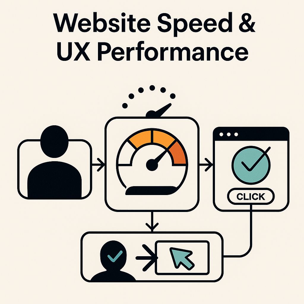
12. Website Speed, Core Web Vitals, and Performance UX
Speed isn’t a feature. It’s a prerequisite. No matter how good your design, how strong your messaging, or how valuable your offer, none of it matters if your site loads slowly. At Southern Digital Consulting, we treat website performance as a user experience layer. Not just a backend task. In Macon, where users bounce quickly and many browse on slower mobile networks, perceived speed is as important as technical speed. Your visitors don’t care about your Lighthouse score. They care about whether your homepage loads before they lose patience. And so does Google.
We start with Core Web Vitals. LCP (Largest Contentful Paint). FID (First Input Delay). CLS (Cumulative Layout Shift). These metrics track how fast your site becomes visible, usable, and stable. Then we go deeper. We analyze render-blocking scripts, third-party scripts, excessive DOM nodes, and unoptimized images. We apply lazy loading for off-screen media. We preload important assets. We compress images and convert them to WebP. We defer non-critical JavaScript and inline essential styles. The result? A leaner, faster site that feels instant. Even before it technically is.
But speed isn’t just code. It’s design too. A site that flashes content, shifts layout mid-scroll, or forces unnecessary animations isn’t fast. It’s disorienting. We reduce interaction latency by designing for predictability and stability. That includes fixed header positioning, early CTA visibility, and scroll pacing that matches user behavior. We test for visual blocking, not just file size. And we map user touchpoints. Especially on mobile. To see where lag breaks trust. Because in Macon, where local businesses rely on online credibility to compete, speed equals professionalism.
Performance UX is about more than tools. It’s about perception. We don’t chase a perfect PageSpeed score. We chase a site that feels frictionless. Responds instantly. And builds confidence with every click. For broader context on how speed fits into your site’s success, explore our article on why Macon websites underperform.
13. Analytics, Tagging, and Conversion Tracking
Without measurement, you’re guessing. And when you’re building a digital strategy in Macon, where every visit counts and every call could lead to a client, you can’t afford to guess. At Southern Digital Consulting, we treat analytics infrastructure as foundational, not optional. That means we don’t just install tracking pixels. We build systems that define what matters, track it accurately, and translate it into insight. Analytics is not just about seeing numbers. It’s about knowing what they mean, where they came from, and what needs to happen next.
Our first step is to align measurement with objectives. We set goal-based tracking: form submissions, call clicks, page scroll depth, video interactions, appointment confirmations. We deploy tools like Google Analytics 4, Google Tag Manager, and Meta Pixel, but only after clarifying what outcomes define success. Then we map each step in the user journey. Awareness. Engagement. Decision. And tag accordingly. Events aren’t labeled “Button Click 12.” They’re labeled “Schedule Button – Service Page – Mobile.” That way, when someone in Macon books a consultation, we know how they found it, what influenced the click, and what path they took.
We also implement conversion tracking through platforms that integrate with CRM and ad systems. That means your ad budget isn’t just spent. It’s accountable. We monitor attribution windows, channel weight, and assisted conversions to understand how different touchpoints support the final decision. And we track micro-conversions too. Early signals that a user is interested. Form start but not submit, time on page over two minutes, scroll depth past 75%. These signals inform not just marketing. They shape UX decisions, content priorities, and navigation layout.
Smart tracking isn’t just about software. It’s about strategy. When your analytics setup reflects your business logic, you stop chasing averages and start acting on evidence. That’s what makes your digital system resilient. And in Macon, where smaller firms often rely on intuition and legacy data, that level of clarity creates competitive advantage.
14. Security, Privacy, and User Trust
Trust is invisible. Until it’s broken. Your site might look polished, load fast, and deliver a great experience. But if users feel uneasy about what happens to their data or how secure their interactions are, they’ll hesitate. And hesitation kills conversions. At Southern Digital Consulting, we don’t treat security and privacy as legal boxes to check. We treat them as user experience fundamentals. In Macon, where many businesses thrive on local referrals and community reputation, trust isn’t earned through design alone. It’s earned through transparency, protection, and proof.
We start with the obvious: SSL encryption, HTTPS protocols, form-level security. But we don’t stop there. Every submission, from a contact form to a lead magnet, must feel safe. We disable autocomplete for sensitive fields. Display encryption icons where users expect them. Ensure all third-party scripts meet compliance standards. Users should never question whether their message went somewhere they can’t see. A secure form builds trust before anyone replies.
Privacy is layered. We help clients implement GDPR/CCPA-aligned privacy policies, cookie consent banners that actually work, and tracking systems that respect opt-outs. But even more important is how these tools are presented. We write privacy copy in plain language. We place trust signals such as privacy links, secure checkout badges, and client testimonials at moments of hesitation. If a user is thinking twice before submitting their phone number, that’s where the reassurance should be.
Trust is also proactive. We recommend ongoing vulnerability monitoring, plugin and CMS updates, and role-based access systems. We help you separate marketing tools from critical data paths. And we always ask: If a user inspected this page, would it look trustworthy? Feel trustworthy? Behave like something built for their benefit? In Macon, where business still depends on handshakes, even digital ones, this kind of trust architecture doesn’t just increase conversions. It protects your brand.

Conclusion: Built to Convert. Built to Last.
Most websites don’t fail because they’re ugly. They fail because they’re disconnected. Content doesn’t serve structure. Structure doesn’t reflect user behavior. Messaging isn’t mapped to moments that matter. But in Macon, where trust is earned one click at a time and every second of load time shapes perception, a site that feels deliberate isn’t just more usable. It’s more believable. At Southern Digital Consulting, we don’t treat web design as an art project. We treat it as a system built to guide, to perform, and to grow. This guide was crafted to show you how. Not just what looks right. What works. What scales. What builds confidence, page by page, across every device and channel.
So what comes next? If you’re ready to move from scattered to strategic, from templated to tailored, from present to persuasive, we’re here to help. We can audit your current site, build new architecture, rework your content, or optimize what you already have. Whether you need a full overhaul or a focused plan, the next move is clarity. And clarity starts with a call.
Looking for a web design partner that understands how structure, speed, and strategy come together in a local market? Explore our work in Macon web design and see how we bring these principles to life.
👉 Schedule your consultation with Southern Digital Consulting
Let’s rebuild your digital presence on purpose. So it earns more trust. Creates more momentum. And delivers more than just traffic.